

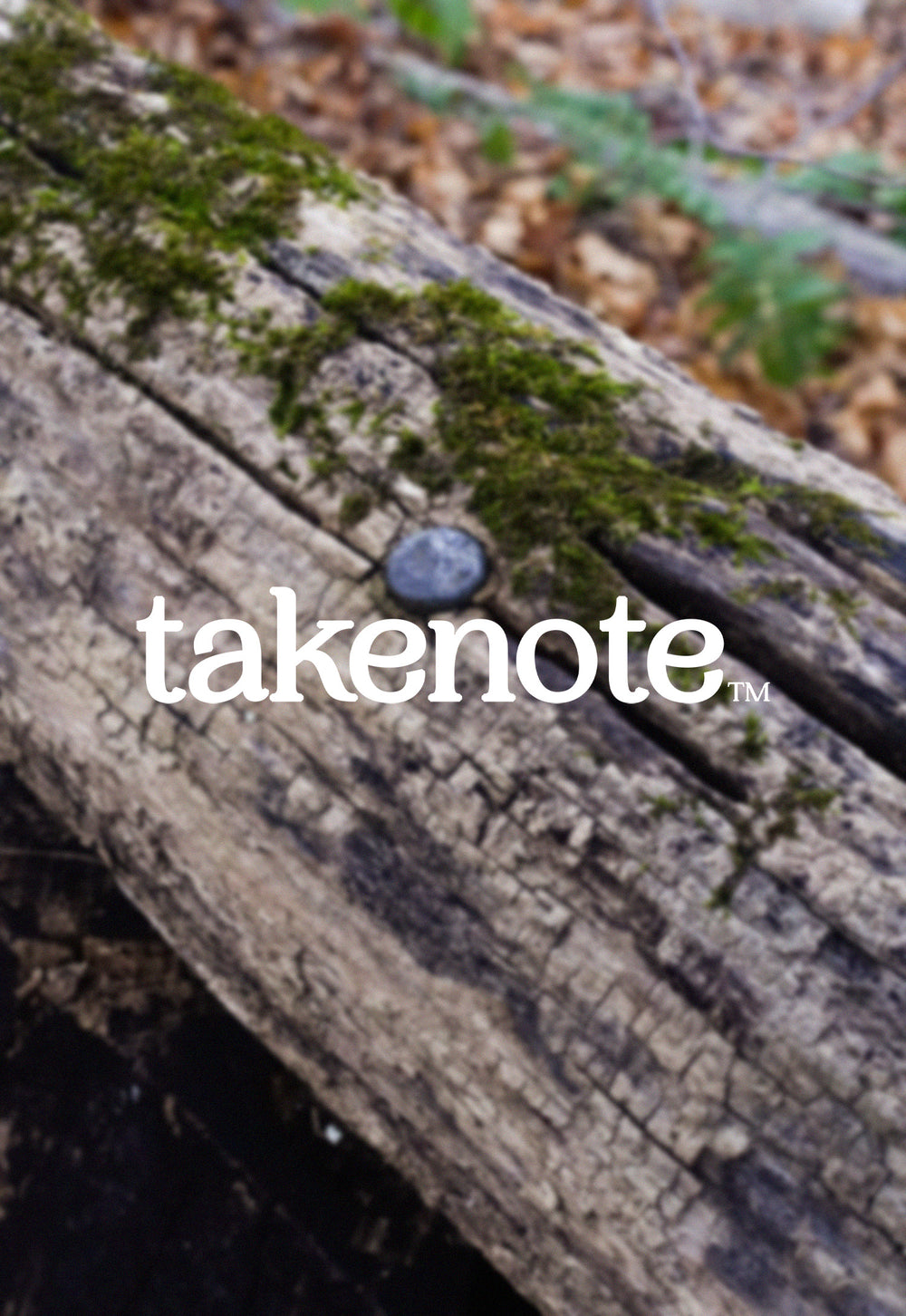

Our New Look
Coming back from our hiatus, we felt it was appropriate to go with the theme of a fresh start by rebranding ourselves. This process includes a new typeface as well as a graphic logo. Heavily inspired by New England's culture and scenery, our designs aim to give off a feeling of the outdoors and exploration. We hope that when you see them, you'll feel it's takenote™.
Typeface
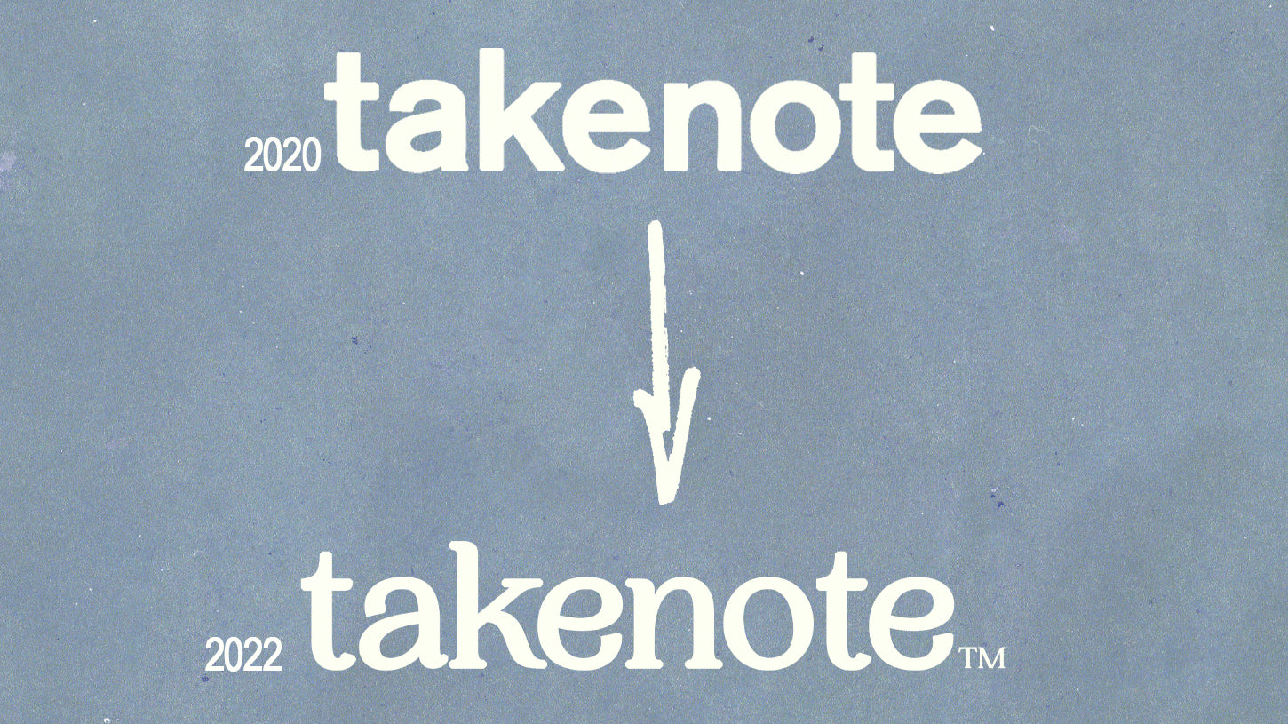
Starting with our typeface, we exchanged our sans serif font for an updated and expressive serif print. Inspired by vintage graphics of local Parks & Rec departments as well as Northeastern National Parks, this new font subtly elevates our brand with a visual history rooted in the outdoors. We're extremely excited to work with this new mark and hope that you find it as appealing as we do.
Terrain Logo

Lastly, our "Terrain Logo" is a visual indicator of our brand and goods. Based off of our motto "For Any Situation", we created the graphic to let every outdoorsman know that our gear is meant to accompany you anywhere and everywhere. The grid sports classic landscape icons of the Northeast and has rich colors for the mountains, sea, and sun. Looking great in any color, size, and applique, we're sure the Terrain Logo will be a trademark of takenote™.
Moving Forward
We design our branding with extreme care and integrity. We understand that every little detail counts. From the woven neck labels to the 16 pt. cardstock hang tags, each piece plays into a bigger picture. With this new branding, we are continuing our effort to improving our company. From the product to the content, we are growing more each day.